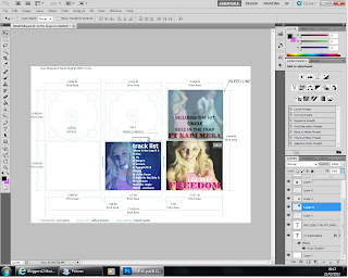
This shows my finished DigiPak with and without the template guide:
Saturday, 23 March 2013
Friday, 22 March 2013
Development of DigiPak
This image shows my digipak background, this is the image that will be shown behind the CD - it is up-side down on this template because when it is folded over it will be the right way round.
Thursday, 21 March 2013
Wednesday, 20 March 2013
Tuesday, 19 March 2013
Friday, 15 March 2013
Digipack research
Main focus of the DigiPak is the artist, close-up images of the artist in detail are shown here. The image all link together and follow the same theme, has to look consistent throughout the DigiPak
The conventions of a Digipak include:
- Main image of artist
- Name of artist
- Name of the album
- Warning of parent consent (if necessary)
- Image for the CD
- List of songs on the back cover
Thursday, 14 March 2013
Improvements
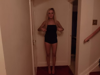
I found that the images I had chosen for my ancillary texts were too out of focus due to being taken on a smart phone. For a more professional and effective image I am going to hire a professional photography camera from college asn retake the images over the weekend.
After taking some more professional looking images I am going to create a 2nd draft for my magazine advert. I will include all the conventions of a magazine advert which I have listed below.
After taking some more professional looking images I am going to create a 2nd draft for my magazine advert. I will include all the conventions of a magazine advert which I have listed below.
The conventions of a magazine advert:
- Image of the artist
- The name of the album
- A Realse date of the album
- Star rating of the album
- Image of the /logo/band symbol/record label
- Artist’s name
- Genre of the band reflected in text/colour/font/images
- Use of new media Persuasive/Eye Catching Text/Images
- Parent advisory label
- The title of the maagazine
- The date of the magazine
Friday, 8 March 2013
Monday, 4 March 2013
Ancillary text
This is my first draft of the magazine advert.
I edited out anything in the background to create a clear background.
I added the title of the artist
I then added the album name and a rating for the album
I added the record label and the advisory label
I the added the title of the magazine I thought my advert would appear in - I chose VIBE because it is an RnB magazine.
I chose pink text because Nicki Minaj uses pinks and mixes RnB genre with pop to create her own style
This is my first completed draft - I'm going to get feedback then make any necessary changes.
The conventions of a magazine advert:
- Image of the artist
- The name of the album
- A Realse date of the album
- Star rating of the album
- Image of the /logo/band symbol/record label
- Artist’s name
- Genre of the band reflected in text/colour/font/images
- Use of new media Persuasive/Eye Catching Text/Images
- Parent advisory label
- The title of the maagazine
- The date of the magazine
Development of Magazine Advert
This is the first edit I made. I edited out anything in the background of the image such as the lights and door frame. I then added the title of the artists name
Sunday, 3 March 2013
Magazine advert research
This is my chosen artists magazine advert, the image matches
the rest of work, such as music videos, adverts and her CD covers which are all
themed pink to incorporate the new album ‘Pink Friday’ therefore here we can
see how this advert has all been themed pink and made the artist the main focus
of the text. The advert does not give much away about dates etc just says the
title of the album and the artist, however here have got a link to website
which provides celebrity gossip which implies more detail will be put on here.
Very simple and little text gives a professional and modern finish to the
advert. Most strongly related to mine due to this being the artist of my chosen
song.
Magazine Advert research
When researching different magazine adverts for albums I
found this one for the band You Me At Six. This one differs from the majority
of adverts as this does not have an image of the artist as the main focus, it
is has an abstract colourful image. This breaks the typical codes and
conventions and could make the advert stand out more. It is also leaves the
image and style of the artist out as you recognise the band by name and
suggests that they only want to focus on their music rather than the image. Advertising
like this is popular with indie bands which relate to being individual and
different, care less about main streams codes and conventions and just focus on
their music. This is a good example of how genres can differ from one another.
Subscribe to:
Comments (Atom)


